
Choosing Colour Schemes for Period Mews Interiors
Reading the Light Before You Read the Colour Chart
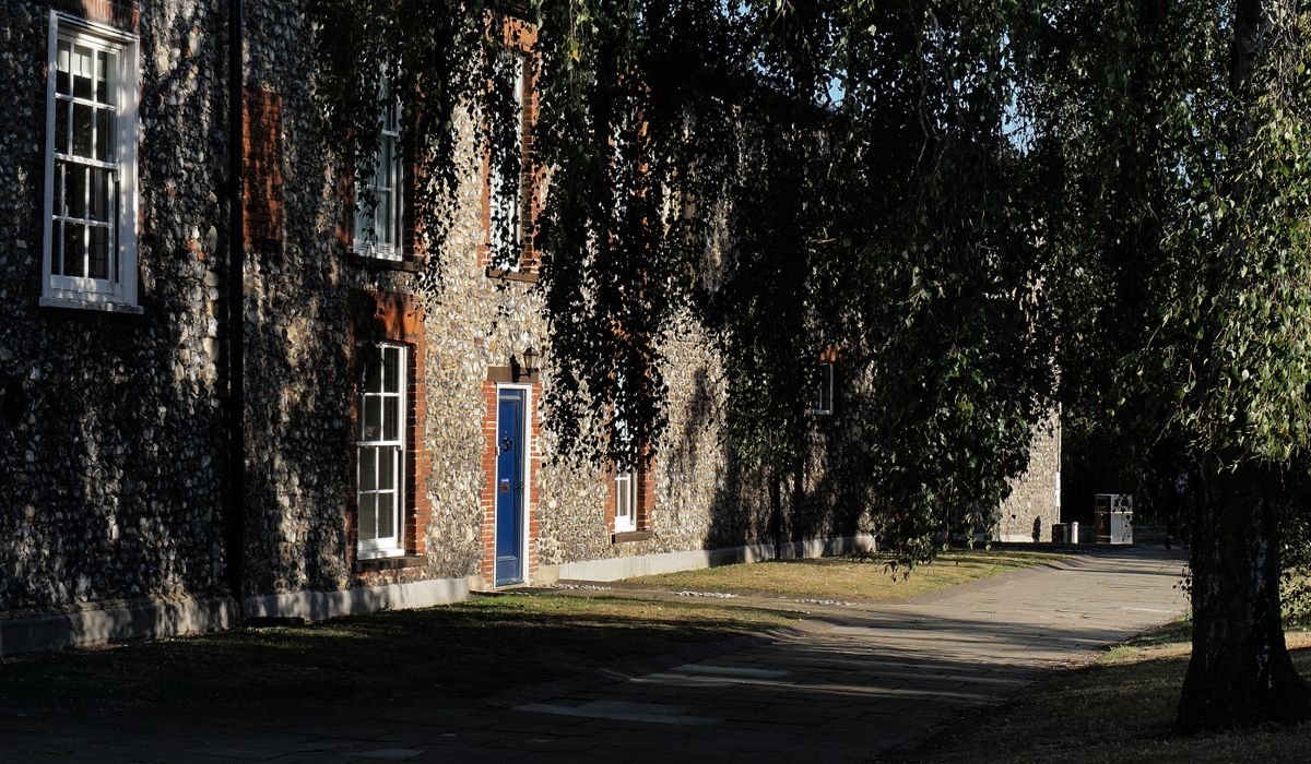
Mews houses were built to serve, not to be looked at. They sit behind grander terraces, tucked along cobbled lanes, often shaded by the buildings around them. Windows tend to be small, ceilings low, and the light that does arrive comes in from one direction only. In a north-facing mews sitting room, the difference between a colour that sings and one that sulks is often a matter of undertone rather than hue.
So before you commit to anything, live with the house for a week. Watch where the sun lands in the morning and how quickly it leaves. Notice whether the walls read grey, yellow or faintly pink at dusk. Then paint large samples — A2 or bigger — directly onto two adjoining walls so you can see how the colour behaves in a corner, where the light falls away.
Warm Neutrals: The Forgiving Foundation
Cool greys are the single most common mistake in a period mews. In a bright, south-facing Georgian room they can look elegant; in a narrow lane-facing snug they turn chalky and slightly grim by three o'clock. Reach instead for neutrals with a warm base: bone, oatmeal, plaster, putty, a chalky off-white with a hint of ochre or clay.
Warm neutrals are forgiving in three ways. They soften the hard edges between rooms in a small footprint, they flatter aged brick and old timber without competing with them, and they hold up against the warm white bulbs you should be using anyway. If you want a single colour running through the ground floor, this is the family to choose from.
Soft Greens and Muted Hues That Suit Old Brick
Greens have a natural sympathy with period mews. Sage, eucalyptus, muted olive, a green-grey, and the softer end of duck egg all sit comfortably beside London stock brick, weathered render and dark-stained joinery. They also read as calm rather than cold, which matters in rooms that are already short of daylight.
A few practical rules:
- Keep saturation low. Strong, bright greens overwhelm small rooms; greyed and earth-toned greens recede beautifully.
- Use a deeper green in a hall, boot room or downstairs cloakroom, where a bit of drama is welcome and the light is never going to be generous.
- Pair green walls with off-white or softly toned trim rather than brilliant white, which will make the green look muddy.
- Clay pinks, soft terracottas and warm stone tones work similarly well and bring a little glow to north-facing walls.
Dealing With Low Ceilings and Narrow Rooms
Low ceilings are part of the charm, but they need negotiating. The trick is to reduce the visual break between wall and ceiling. Paint the ceiling the same colour as the walls, or one shade lighter, in a flat finish. That single change can make a small room feel taller and far more considered than the default white ceiling above dark walls, which simply draws a line across the room at the lowest possible point.
For narrow spaces, put the deepest tone on the wall opposite the window. It absorbs the light coming in and stops the far end of the room feeling like a tunnel. Keep the window wall lighter so daylight has something to bounce off. And consider painting radiators, doors and under-stair cupboards in the wall colour — reducing the number of visible objects is often more effective than any clever trick with mirrors.
Joinery, Floors and Finishes That Hold It Together
Paint finish matters as much as colour. In period properties, dead flat emulsion or a limewash-style paint gives a soft, chalky surface that suits uneven old plaster and hides minor imperfections. Vinyl silk will highlight every lump and bounce light around in a way that feels distinctly modern.
For woodwork, move away from brilliant white gloss. An off-white eggshell, or a trim colour a shade or two darker than the walls, looks more settled and much better against aged timber. If your floors are original boards or reclaimed timber, check your paint samples against them — a warm floor will make a cool wall look colder still, and vice versa.
Building a Palette You Can Live With
Aim for no more than four or five colours across the whole house, and let them repeat. A warm neutral for the main living spaces, a soft green or clay tone for bedrooms and studies, a deeper version of the same family for halls and cloakrooms, plus one consistent trim colour and a single ceiling treatment. That discipline is what makes a small mews feel calm rather than cramped.
Buy sample pots, paint them onto lining paper, and move them around the house at different times of day. Colour in a mews is never really about the colour itself — it is about how it behaves in the particular light you have been given. Choose accordingly, and the house will feel warmer, taller and quieter than you thought possible.
tag: Interiors

Harriet Bletchley Author
Galley layouts, tall units, and integrated appliances can maximise storage without making a compact mews kitchen feel cramped.
YOU MAY ALSO LIKE
Small Kitchen Ideas for Compact Mews Homes
Sep 18
10Listed mews properties require careful planning, sympathetic materials, and expert advice before you begin any major renovation work.
read more
A Guide to Renovating a Listed Mews House
Sep 13
10Roof lights, internal glazing, and light wells can transform dark mews interiors while respecting the original stable structure.
read moreInteriors
-

ERRIC CATONA
Clear schedules, written contracts, and regular site meetings help keep your mews renovation on time and within budget.
May 19, 2016 at 5.12 pm
Reply
ERRIC CATONA
Courtyard gardens suit mews homes with clever planting, built-in seating, and vertical greenery that softens brick walls.
May 19, 2016 at 5.12 pm
Reply -
ERRIC CATONA
Choose hardy shrubs, evergreen climbers, and drought-tolerant perennials to keep a compact mews garden looking good all year.
May 19, 2016 at 5.12 pm
Reply
Renovation
Your email address will not be published.